Milliner

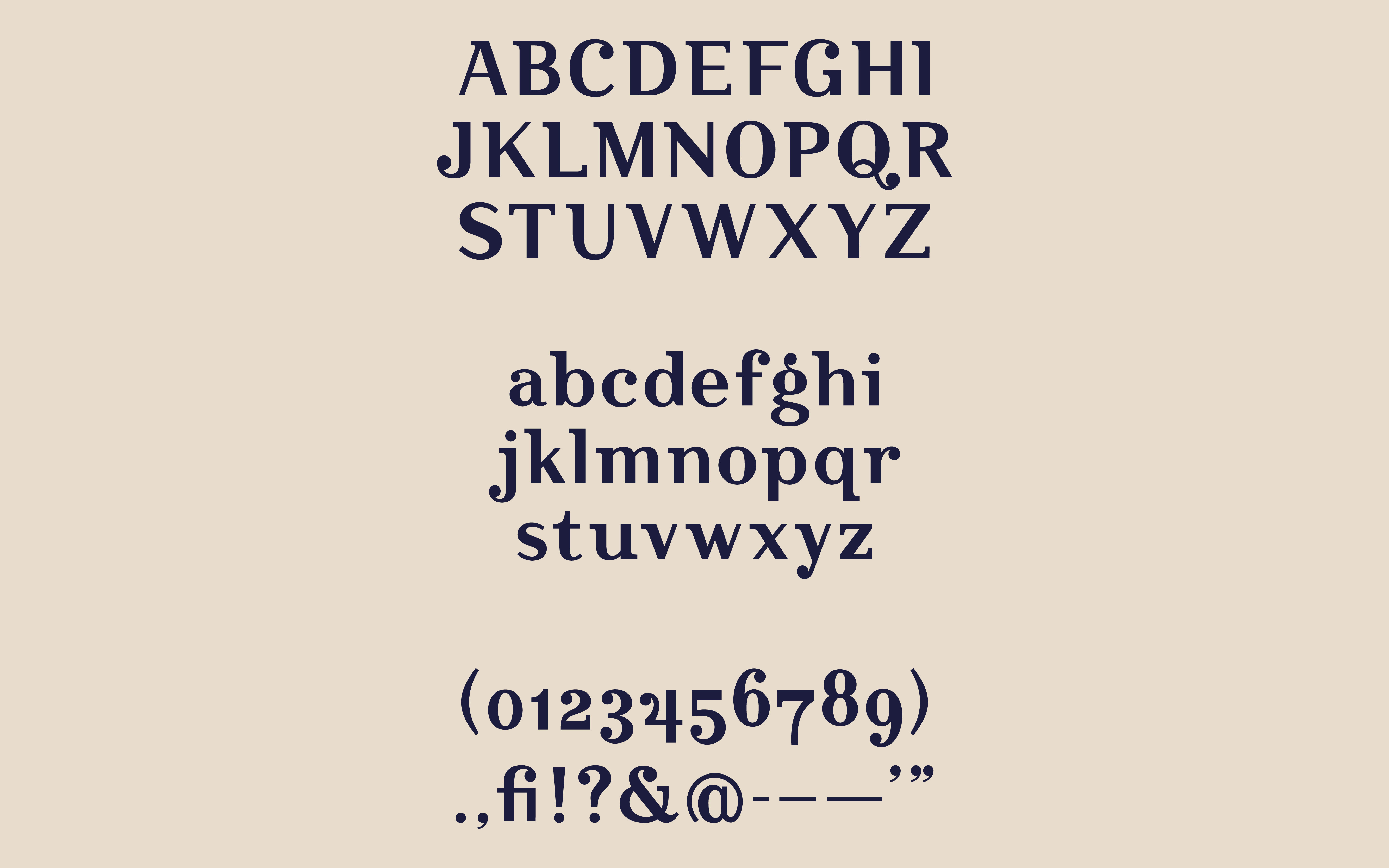
A jolly semi-serif typeface derived from an old, Czech hat maker's sign.

Our Specimen

Duration:
9 Weeks
My Part:
Drawing & digitally designing letter forms, Type Master of capital letters
SAMI EVERHART

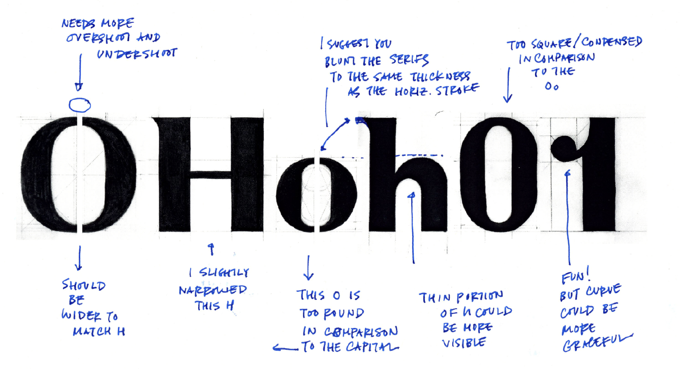
OHoh01

Starting with OHoh01 was a great jumping off point for finding our measurements for upper and lower case letters. After a few critiques and variations for how to shape the letters we were able to figure out a system.
SAMI EVERHART

Refining

Thanks to our infamous type teacher Karen Cheng, writer of Designing Type, we were able to figure out how we could refine the letter to make them as playful as the hand-painted sign.

IN DEPTH LOOK

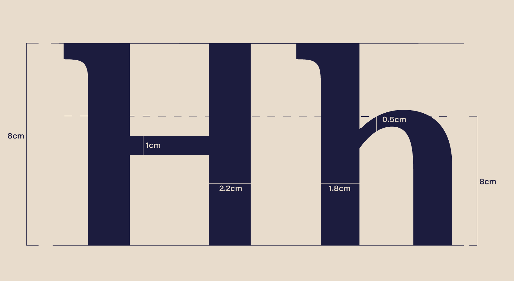
The Measurements

After many drawings and re-drawings we were able to figure out physical measurements that would help our group make cohesive letter forms. These are the physical measurements we used to draw each upper and lower case letter.

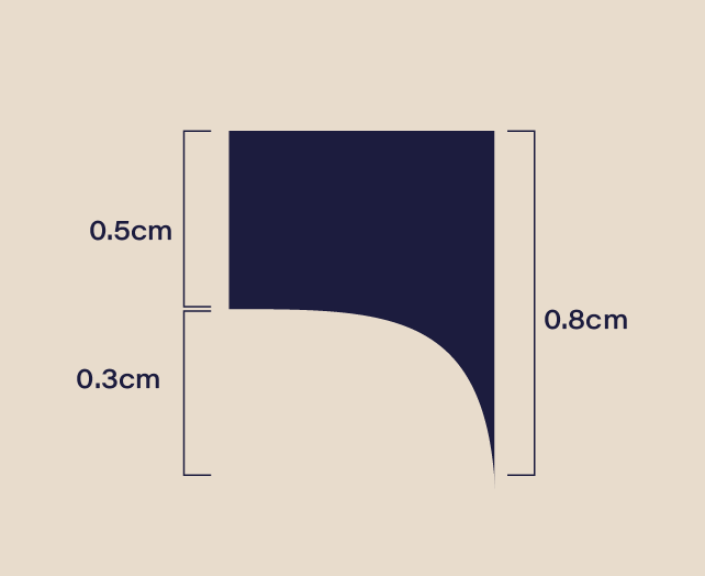
The Serif

The original Jares had pointed serifs which seemed a bit too sharp and aggressive for the large thicks, thins, and playfulness that captures this particular typeface. So, we blunted the serifs to convey a friendlier approach.

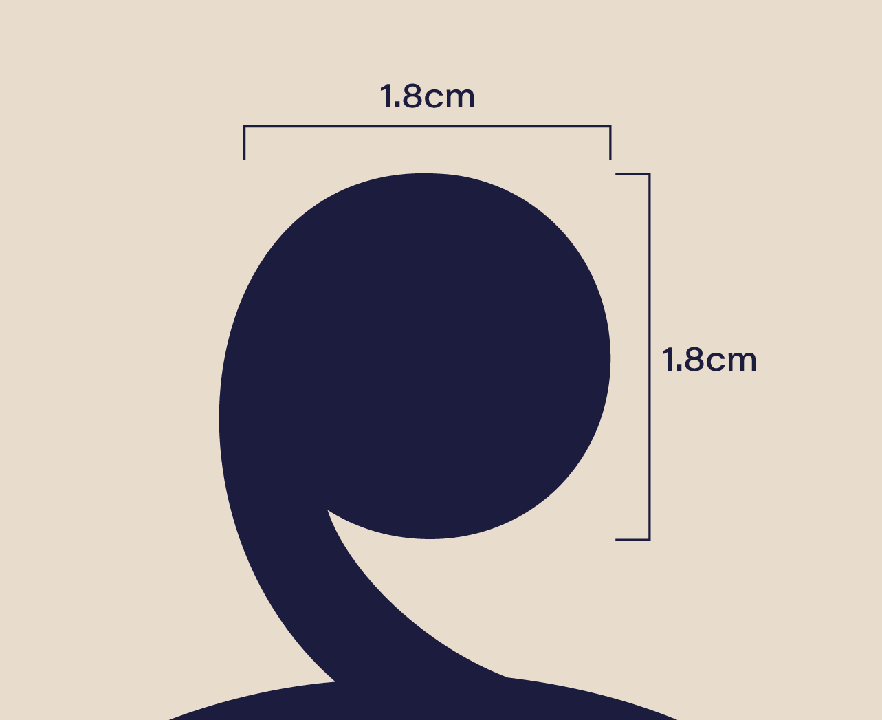
The Ball

Although the ball was VERY difficult to balance with the some letters, it was also something that brought levity and character to each one. We did not end up using a ball terminal on the "1" because of balance problems, but we were happy with how the ball turned out and, in my opinion, gives the type a unique bounce!

FINAL

The Result

Milliner is a joyful typeface that leaps off any medium with its quirky ball terminals and eye catching semi-serif. It's refined but eccentric letterforms helps distinguish this display font as an experience that will show the user a good time. The ear on the "g" is not similar to most lowercase g's as it's placed on top like a hat one that a milliner —or as some may say, hat maker— would be proud of.

My Letters: C, G, O, U, S, c, e, g, h, m, n, o, u

What This Gave Me

A new way to work in groups:
This experience was one that I have learned the most from. Not only about design but, about myself and how I handle new situations and conflicts. I was very fortunate to be part of a group who was so passionate about their work and gave me the opportunity to learn so much more about themselves.

Refinement of my skills and eye:
Our professor from the beginning said once you take this class you will never be able to see type the same way, and she is completely right. This project helped me see the smaller details and hone in on my craft, I truly felt after this class that I really evolved into a better designer because of this project.

Lastly, I would love to give a special thank you to Evita Widjaja, Rachel Fazio, Melissa Takai, and Shelley Tsui who were part of the team who made Milliner. Shelley's hard work on the numbers was astonishing, she really transformed what was an absolute mess to something I am proud to show off. Evita Widjaja worked tirelessly on the balance of letters like the "a" and it couldn't have turned out better. Melissa Takai, the other typemaster, really refined the lowercase letters and made the colors incredibly consistent. Rachel Fazio did a great  job at critiquing and helping make our poster shine.

SAMI EVERHARTWORKMOREABOUT