Shift

Treat Yourself

A buy 3 get 1 free promotion that spanned a couple of weeks to sell down delinquent overstock.
Team: Direct to Consumer
Project Lead: Lauren Boriotti (Sr. Manager of Digital Marketing)
Tools: Photoshop, Jira
Duration: 1 week
Deliverable: Paid social and digital asset creation
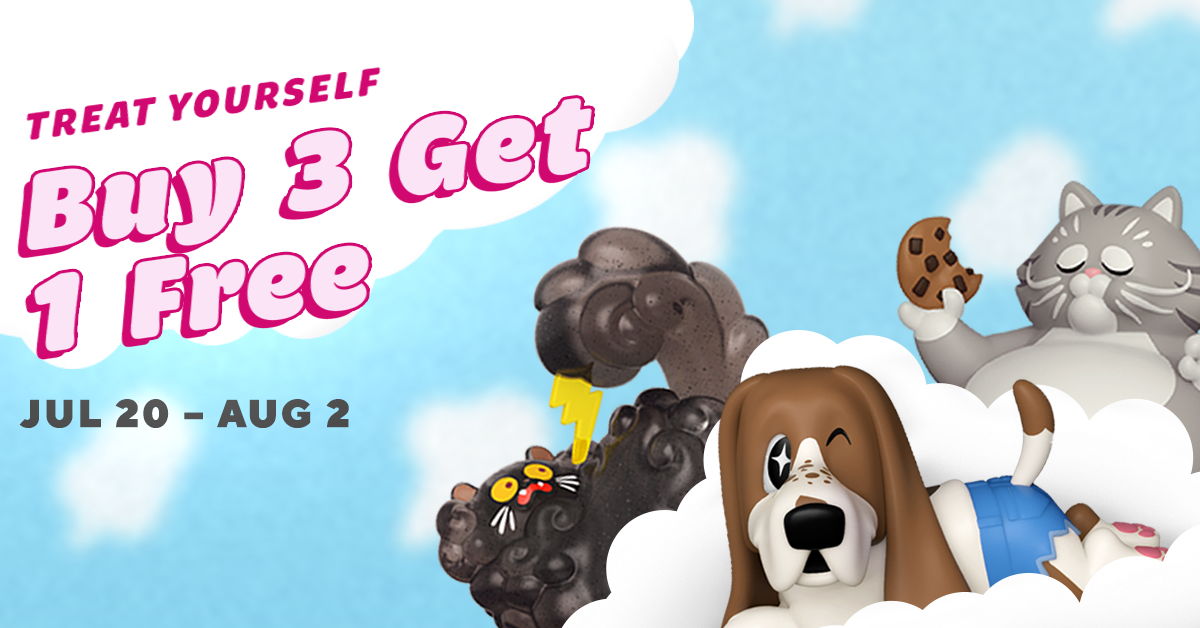
Social banner used for the Treat yourself promo

Context

I was tasked with designing a campaign that went hand-in-hand with the theme of "Treat Yourself." The project assigner asked for something that felt both sweet and summery and had attached a few suggestions for optional products to use.

Process

Before —
I had asked my co-worker about the promotion before to get a feel for what had been done and make sure that it felt different and less redundant from the past year (see above).
Ideas —
Most of the optional products that were available to be used was Funko's own IP, so I thought using them would help promote our items and create more brand recognition for our audience.

Digging and Deciding

I knew I wanted to use our products called Paka Paka. They all have a very sweet and cute nature to them that I thought related well with the overall theme of the campaign.

Next was deciding and figuring out which characters would be best suited and what would make them stand out! Some Paka Paka's already have associations with treats and sweetness, but the look and feel sometimes differs from the summer vibes that we were going for.

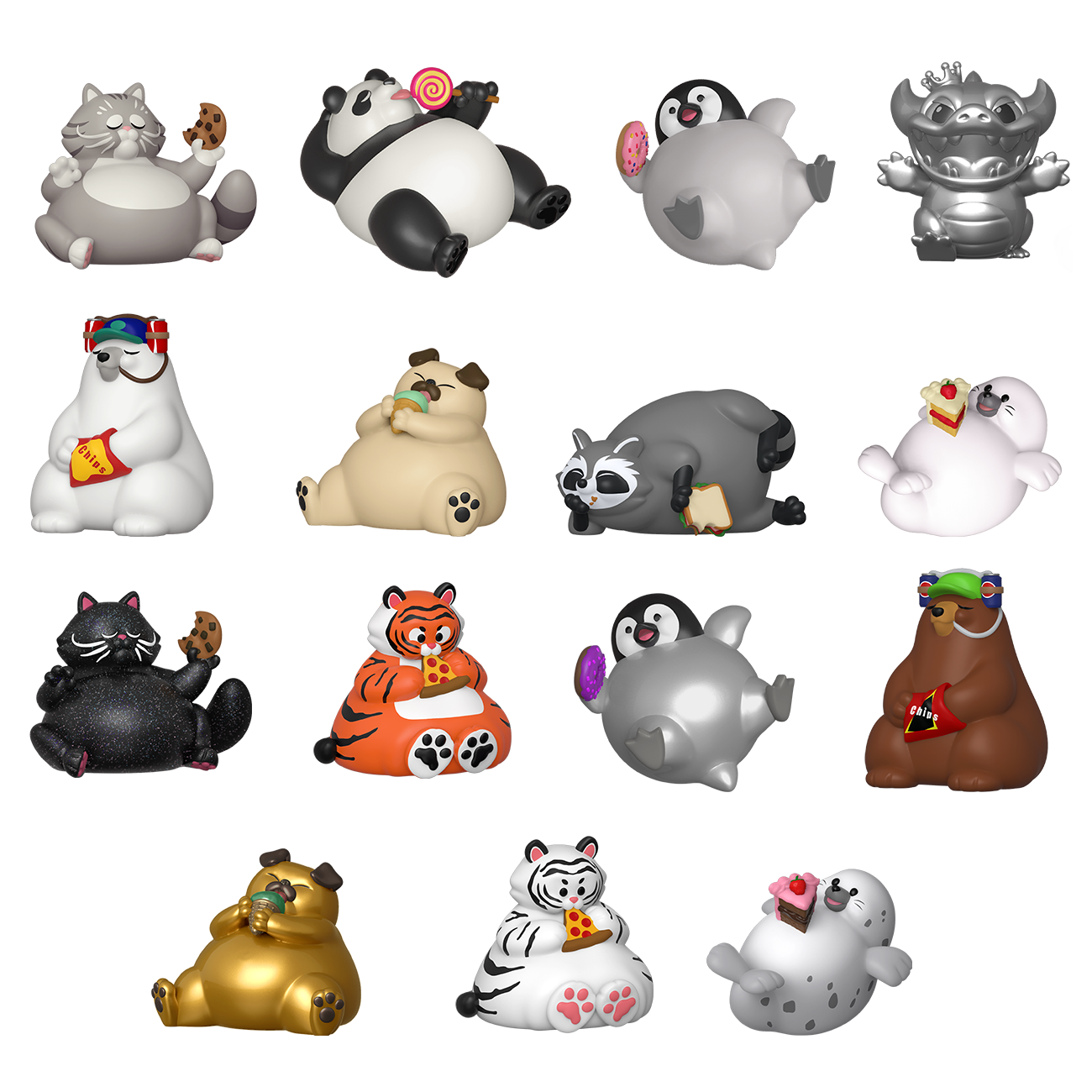
In the end I definitely wanted to include our products called "Munchies"


First Iterations

Since this was my first week without my design lead on the marketing team, I had no idea how I was going to navigate this. The concept and options were cast so wide I wasn't sure where to go next. But I dived head first with the optional assets given to me and created VERY loose drafts and iterations that I thought could be an options for this promotion

Putting the Cherries on Top

I decided the most important message for the audience would most likely be the promo jargon. Consumers, I have found, want to know what the deal is and pay little attention to the actual campaign theme. So I tried making the the promo as transparent as possible. After I narrowed my ideas, I decided to hone in on the typography and colors to make it feel like a sweet summer deal.
Funko.com Front Webpage
Funko Pop! Culture Newsletter
Social — Instagram
Me
Misc.
Sami Everhart

Take Aways

Since this was my first project without my graphic design lead I learned a lot in working with the circumstances and tools I had. I learned a lot about getting ahead of the problem and covering all the bases for what my team needed and was looking for and the impact of swift and thorough design language in communicating the design process to those who are not familiar with it.
Funko Project Page
Home